
Forex Intermediate
When to Buy, When to Sell
When you start trading in the forex market, it is critical to have a sense of when you will need to buy a currency — and when it is time to sell. This might seem like an easy task but if that were the case all forex traders would be millionaires. Any time you enter into a forex position, you are simultaneously buying one currency and selling another. The forex positions that are most profitable are the ones that pair the strongest currencies with the weakest currencies against one another. With this in mind, it is always important to know when to buy and when to sell. This is the only way to make sure that your forex trades are structured properly.
Bullish Outlook
In order to enter into a long position for any currencies, you will need to have at least a few arguments to support the bullish outlook. This can be accomplished using either technical or fundamental analysis but the strongest positions are generally based on a little of both. Those starting with fundamental analysis will generally analyze recent economic reports or read into the expectations for an upcoming economic report.
For example, lets assume that GDP numbers are expected out of the United States. Analyst expectations show that the number is likely to show results that were weaker than what was seen during the previous quarter. The report is later released, and the final result shows that economic growth for the period was actually stronger than what was seen during the previous quarter. This result jars the market expectation and many forex traders that initially sold the USD short are now forced to reverse their positions. From a technical perspective, this trading activity sends the USD through historical resistance levels and a bullish breakout looks to be in place.
Bearish Outlook
On the same trading day, lets assume that employment numbers are released out of Canada. Analyst expectations initially showed that the majority of the market expected the results to be stronger than what was seen during the previous month. The report is later released, and the final result shows that the number of jobs created during the period was actually weaker than what was seen during the previous month.
This result changes the market outlook and many forex traders that initially bought the CAD are now forced to reverse their positions. From a technical perspective, this trading activity sends the CAD below historical support levels and a bearish breakout looks to be in place.
Combining Market Information to Place a Trade
How can all of this new market information be used to place an actual forex trade? First, we can see that the economic data in the United States supports the bullish outlook and that the value of the currency is still cheap (given the fact that most of the market was selling the currency on the expectation for weaker data). This positive outlook is further supported by the fact that the USD is now breaking above important resistance levels. This will often propel the bullish momentum and send forex prices much higher. All told, this is good reason to buy the USD as the bias is now bullish from a number of different angles.
At the same time, we have building evidence to sell the Canadian currency. Economic data came in weaker than what was expected by the majority of forex market analysts and prices have fallen through critical support levels. This suggests a downside breakout is imminent, and that forex traders should now be looking for opportunities to sell the CAD. Taken together, forex traders will now be looking to sell the USD/CAD as the balance of the evidence now calls for much higher prices in the forex pair.
Conclusion: Combine Opposing Outlooks When Placing Forex Trades
This hypothetical position in the USD/CAD shows the ways forex traders are able to construct an outlook and combine expectations for strength and weakness in executing a trade. This type of approach generally results in the most profitable trades. If possible, it is best to avoid scenarios where strong currencies are paired with other strong currencies in long positions (or pairing weak currencies with other weak currencies in short positions). Opposing outlooks work best, and the forceful moves that are created by this strategy are capable of producing substantial profits.
Developing A Strategy
Once you have learned the basic mechanics of the forex markets, you will need to start developing a strategy. It is true that there is no hard and fast way for accomplishing this because forex trading is a very individual experience and there is a wide variety of methodology that can be employed. But there are some broad themes that can be dissected in determining which approach is best for you and your forex trading. Here, we will discuss some of these factors.
Time Frames
Perhaps the first distinction that needs to be made is whether you plan on being a short term trader, or a long term trader. Do you plan on implementing scalping strategies or day trading practices that will lead you to exit your positions in a matter of hours? Or do you prefer to establish positions that allow market trends to unfold over weeks or even months at a time? These are critical questions that will depend heavily on your level of time availability and ability to accept tolerance for risk.
Specifically, forex traders that are not able to monitor their trading stations for at least a majority of the day should probably avoid scalping and day trading strategies. There are simply too many factors at work and surprise changes in market volatility can quickly lead to losses while “no captain is at the helm.” This is unnecessarily dangerous, so if you are unable to devote the time required each day it makes much more sense to adopt a longer term approach. Additionally, shorter term strategies tend to be associated with higher levels of risk because it is generally more difficult to anticipate where market prices will trade in the short term. If you do not possess a high tolerance for risk, it is probably better to adopt a longer term trading strategy.
Price Charts or Economic Reports?
The next topic to consider is whether you will begin with technical analysis or fundamental analysis. For traders with mathematical aptitude, chart analysis tends to be preferable. This is because these traders analyze price changes in relation to their historical averages in order to determine which trend direction is likely to come next. This approach also deals with chart indicators that run price action through formulas to determine when prices have risen too high (become overbought) or fallen too low (become oversold). If these practices sound like they are appropriate for your strengths, chart analysis is likely to inform most of your strategy.
For forex traders that come from a more literary perspective, fundamental analysis is generally the best approach. Here, forex traders will need to assess economic data releases such as GDP, jobs data, inflation, and the stated stance of the central bank. Most of the fundamental outlook is informed by any possibility that the central bank will increase or decrease interest rates. So any strength or weakness in the economy data released by that country will be viewed in that context. Has GDP growth and price inflation started to increase at a rate that is rapidly becoming unsustainable? This might be a scenario that forces the central bank to raise interest rates — a strong prospect for any currency in the forex market. Conversely, sluggish jobs growth and falling consumer prices might suggest that the central bank will need to cut interest rates — a clear reason to start selling the currency. These are some of the types of factors that fundamental analysts will need to consider when looking to establish active positions in the market.
Combining Strategies
In some respects, it is not a good idea to combine multiple strategies as this can lead to confusion and conflicting rationale behind your trades. But it should be understood that most forex traders will draw from more than one knowledge pool when constructing a market outlook. For example, there is nothing wrong with conducting fundamental analysis to determine which currency you want to buy, and which you want to sell. You could then use technical analysis to determine which price level you want to use to enter into the trade, and where you want to place your stop loss and profit target for the positions.
The degree to which you choose to combine strategies will depend on your individual strengths, your level of time availability, and your broader outlook for the market. These are not elements that anyone can define for you, it will be up to you to watch the market and settle on the approach that works best for your financial goals.
When to Buy, When to Sell
When you start trading in the forex market, it is critical to have a sense of when you will need to buy a currency — and when it is time to sell. This might seem like an easy task but if that were the case all forex traders would be millionaires. Any time you enter into a forex position, you are simultaneously buying one currency and selling another. The forex positions that are most profitable are the ones that pair the strongest currencies with the weakest currencies against one another. With this in mind, it is always important to know when to buy and when to sell. This is the only way to make sure that your forex trades are structured properly.
Bullish Outlook
In order to enter into a long position for any currencies, you will need to have at least a few arguments to support the bullish outlook. This can be accomplished using either technical or fundamental analysis but the strongest positions are generally based on a little of both. Those starting with fundamental analysis will generally analyze recent economic reports or read into the expectations for an upcoming economic report.
For example, lets assume that GDP numbers are expected out of the United States. Analyst expectations show that the number is likely to show results that were weaker than what was seen during the previous quarter. The report is later released, and the final result shows that economic growth for the period was actually stronger than what was seen during the previous quarter. This result jars the market expectation and many forex traders that initially sold the USD short are now forced to reverse their positions. From a technical perspective, this trading activity sends the USD through historical resistance levels and a bullish breakout looks to be in place.
Bearish Outlook
On the same trading day, lets assume that employment numbers are released out of Canada. Analyst expectations initially showed that the majority of the market expected the results to be stronger than what was seen during the previous month. The report is later released, and the final result shows that the number of jobs created during the period was actually weaker than what was seen during the previous month.
This result changes the market outlook and many forex traders that initially bought the CAD are now forced to reverse their positions. From a technical perspective, this trading activity sends the CAD below historical support levels and a bearish breakout looks to be in place.
Combining Market Information to Place a Trade
How can all of this new market information be used to place an actual forex trade? First, we can see that the economic data in the United States supports the bullish outlook and that the value of the currency is still cheap (given the fact that most of the market was selling the currency on the expectation for weaker data). This positive outlook is further supported by the fact that the USD is now breaking above important resistance levels. This will often propel the bullish momentum and send forex prices much higher. All told, this is good reason to buy the USD as the bias is now bullish from a number of different angles.
At the same time, we have building evidence to sell the Canadian currency. Economic data came in weaker than what was expected by the majority of forex market analysts and prices have fallen through critical support levels. This suggests a downside breakout is imminent, and that forex traders should now be looking for opportunities to sell the CAD. Taken together, forex traders will now be looking to sell the USD/CAD as the balance of the evidence now calls for much higher prices in the forex pair.
Conclusion: Combine Opposing Outlooks When Placing Forex Trades
This hypothetical position in the USD/CAD shows the ways forex traders are able to construct an outlook and combine expectations for strength and weakness in executing a trade. This type of approach generally results in the most profitable trades. If possible, it is best to avoid scenarios where strong currencies are paired with other strong currencies in long positions (or pairing weak currencies with other weak currencies in short positions). Opposing outlooks work best, and the forceful moves that are created by this strategy are capable of producing substantial profits.
Understanding Economic Reports
Few trading markets are more heavily influenced by macroeconomic data than the forex market. This is because national economic indicators provide the best evidence for potential strength or weakness in a currency. These reports also give traders an idea of whether or not a specific central bank will need to raise interest rates in the future. These events are always scheduled in advance and it is generally very easy to get a sense of whether or not the market is optimistic or pessimistic in terms of how strong the results are likely to be.
But not all of these reports will move the market in equal amounts, so it is important to have some sense of what these reports actually indicate so that forex traders can assess whether or not new positions should be established once the information becomes public. Here, we will look at some of the economic reports that are most commonly watched by forex traders.
Gross Domestic Product (GDP)
The Gross Domestic Product (GDP) report is the broadest measure of economic activity within a country. Specifically, the report measures the sum total of all goods and services that are produced in the country. These results are generally reported on a quarterly or yearly basis, although there are some countries that will release these figures on a monthly basis. The GDP report ultimately reveals which sections of the country’s economy are growing and which are weakening. Forex traders use this report to gain an understanding of whether or not there is underlying growth in a country, and the overall GDP number tends to be a good indicator for long term positioning.
Non Farm Payrolls and the Unemployment Rate
The monthly Non Farm Payrolls (NFP) report measures the total number of jobs that were created during the previous month. Where the GDP report tends to be great for long term forex positioning, the monthly NFP data is great for establishing trades that are based on one day to one week time frames. It could easily be argued that the NFP report creates more volatility than any other economic report, as nearly every asset market will experience violent price fluctuations once this information is made public.
At the same time, the unemployment rate is released. This report measures the national percentage of unemployed people in the workforce that was seen over the previous month. The unemployment rate tends to receive less attention in the financial media when compared to the headline NFP number, but both should be viewed in combination as a means for gauging the strength of the country’s labor market.
Industrial Production and the Purchasing Managers’ Index (PMI)
On the manufacturing front, two of the most commonly watched reports include the Industrial Production (IP) and the Purchasing Managers’ Index (PMI). The IP report measures changes in productivity levels for the country’s utilities, mines, and factories. Additionally, the report marks a gauge of industrial capacity and the extent to which that capacity is being used (capacity utilization). The IP report is generally released on a monthly basis.
The next important manufacturing report is the Purchasing Managers’ Index, which is released by the Institute for Supply Management. This report creates a composite index of the manufacturing conditions that are present across the country. The results include factors like supply inventories, new orders, delivery times, product prices, employment levels, and orders that are seen in both imports and exports. The PMI data is released as a number from 0 to 100. Numbers above 50 signal expansion, while numbers below 50 signal contraction. The PMI report is released on a monthly basis.
Inflation – Consumer Price Index (CPI) and Producer Price Index (PPI)
Last, we look at inflation data. Reports in this category are generally seen in the Consumer Price Index (CPI) and Producer Price Index (PPI), which measure price inflation at the consumer and producer levels. The PPI measures changes in the sale prices for a basket of commonly produced goods in the utility, agriculture, mining and manufacturing sectors. Forex traders use this information to determine the ease with which producers are finishing their goods, and the prices they are able to command for those goods.
The CPI report is more commonly watched by forex traders, as it measures the average prices paid for goods at the consumer level. This is a much larger section of the economy, so it tends to be considered a better indication of the broader strength or weakness throughout the country. The CPI reports on average price changes for products in more than 200 consumer categories, so this is a comprehensive inflation report that can be used for fundamental analysis by forex traders.
Trends in Forex Markets
When we think about some of the most commonly heard sayings in the financial markets, one of the first that come to mind is “the trend is your friend.” In forex markets, this saying is perhaps more true than anywhere else. This is because currency valuations spend most of the time trending in one direction or another. There are many explanations for why this might occur. But one of the most plausible explanations is the fact that macroeconomic scenarios for entire countries usually do not change very quickly.
This is useful information for forex traders, because it makes it much easier to establish positions in the direction that is taken by the majority of the market. When this is done, those positions can benefit from the large amount of momentum that is already present. And, in many cases, this can be enough to turn the odds in your favor and generate long term trading success.
What Constitutes a Forex Trend?
In forex markets, trends are typically described as a series of highs or lows that occur in succession. For an uptrend, this would mean that most forex traders would want to see a series of three consecutive higher highs, along with three consecutive higher lows. For a downtrend, most forex traders would want to see a series of three consecutive lower highs, along with three consecutive lower lows. Without this, no real trend is in place and markets could be described as trading sideways.
Consider the chart below in the GBP/USD:
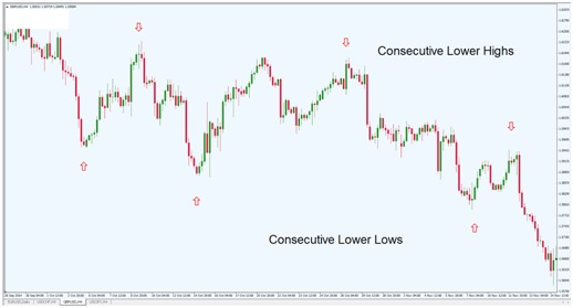
Chart Source: Metatrader
What information does this chart tell us? This price structure would be an example of a downtrend and suggest that most of the market is positioned in the bearish direction. Here, we can see three consecutive higher highs and lows, which is enough to meet the definition of a downtrend. Forex traders could use this information to establish short positions, selling the GBP/USD at the market rate.
Pay special attention to the ways the structure of highs and lows appears visually on the chart. To the left of the chart, prices start much higher, and then finish much lower as we move to the right. Price activity unfolds in a series of bearish waves that build on one another and generate negative momentum. When this much bearish movement is present in the market, forex traders are able to turn the odds in their favor when taking short positions, as there is nothing yet to suggest that price activity will reverse to the positive direction.
Next, consider the chart below in the EUR/USD:
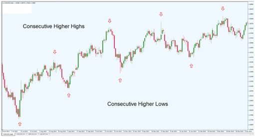
Chart Source: Metatrader
This price structure would be an example of a solid uptrend. Here, we can actually see four consecutive higher highs and lows, which is more than what is needed to define an uptrend. So the uptrend would have officially started once the third set of higher highs and low was posted.
It is most important here to have an understanding of how the structure of highs and lows appears visually on the chart. But it is also useful to note that an uptrend with a series of four higher highs and lows would be considered stronger than one with three in the series. In an uptrend, more is generally better and trades that are placed based on stronger uptrends are considered to have better chances for success.
Trend Lines
Once you have spotted the series of highs and lows that define a trend, you will then need ways of determining whether or not the initial trend is still active. This can be done using trend lines, which can be easily plotted on most forex trading stations.
Let’s look again at the GBP/USD:
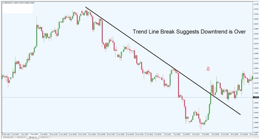
Chart Source: Metatrader
Here, we have a strong series of lower highs and lows that can be used to define the broader downtrend. This series enables traders to easily draw a downtrend line that makes it less difficult to see the trend visually. Short positions can be taken here, but only as long as that downtrend remains valid. Toward the right end of the chart, we can see that prices start to rise above the downtrend line — and this is an early signal that the downtrend has reached its point of completion. This is also a signal for forex traders to close any short positions that were opened previously.
Next, let’s look at the uptrend seen in the EUR/USD:
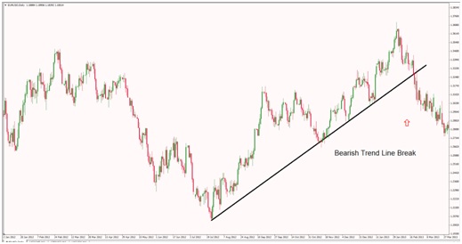
Chart Source: Metatrader
Here, we have a strong series of higher highs and lows that can be used to define the broader uptrend. This series enables traders to easily draw a uptrend line. Long positions can be taken here, but only as long as that uptrend remains valid. Toward the right end of the chart, we can see that prices start to fall below the uptrend line — and this is an early signal that the uptrend has reached its point of completion. This is a bearish signal for forex traders to close any long positions that were opened previously.
Trading Sessions
Once you have covered the basics of forex, you are ready to start placing actual trades. But in order to do this, you will need some idea of when each trading session occurs. It is true that the forex market is indeed a 24 hour market, as trades are literally executed at all hours of the day. But there are separations buy time zones that mark when the majority of trades are placed. In forex, market sessions are divided into three parts: the Asian session, the North American session, and the European session. Here, we will look at a scheduled outline in order to see where market liquidity is likely to reach its peaks.
Asian Session
The Asian trading is often referred to as the Tokyo session, and this is the first session that forex markets see to start the week. The Asian session begins at 12am GMT and then runs until 6am GMT. This is technically the weekly kickoff for the forex markets, so the first major injections of liquidity are seen during this period. For brokers with variable spreads, this is also the time when those spreads will tighten back to what is normally seen throughout the rest of the trading week. It should be remembered that the Asian continent does have multiple time zones, so not all of the new market orders are going to start at 12am GMT. But this is typically thought of as the start of the forex trading week.
European Session
Next comes the European trading session, which is often referred to as the London session. Typically, the London session is defined as starting at 7am GMT to 4pm GMT. This will cover most of the trading that occurs in large markets like Germany and France, in addition to the UK. At this stage of the week, there is still some overlap between trading seen in many Asian countries, so there is much better liquidity than what is seen at the beginning of the Tokyo session. Generally, forex traders do see a slowdown in price movements at from roughly 6am GMT to 7am GMT as many Asian traders have closed out their positions for the day and European traders have yet to start executing trading orders in large numbers. Because of this, it is possible to see some widening of spreads during this time, as there is reduced liquidity in the market.
North American Session
The highest liquidity levels during any forex trading day can be seen during the North American session, which is often referred to as the New York trading session. This session begins at roughly 12pm GMT, and it should be noted that Europe is only halfway finished with its own trading day. This is why more market orders are present at this period than at any other. Another factor to consider is the fact that the most market-moving economic events tend to be made public early on during the New York session, so for those forex traders that are looking to trade based on news events, some of the best opportunities can be found during the beginning of the New York session. This session draws to a conclusion at 9pm GMT, and this is also the final trading of the week ending on Friday.
Session Carry Over
In many cases, there will be carry over from the previous session. For example, if there is a strong trend that is seen during the European session, it would not be surprising to see something similar during the New York session. But this is perhaps most true during the Asian session, as those traders tend to react to whatever news events were seen at the North American open. So, for those with a day trading outlook, it is generally a good idea to monitor the trends that had taken place during the prior session, as this is an excellent way for forex traders to get a sense of where market momentum is likely to move in the coming hours and into the following trading day.
In all, market activity tends to slow in the time between trading sessions, and then pick up in volatility once the next continent starts establishing new positions. This can be very useful information when deciding on a stance for short term forex trades.
Moving Averages in Technical Analysis
From the perspective of a technical analysis, there are not many charting tools as indispensable as the moving average. There are many different reasons for why this is the case. But what is less debatable is the overall efficacy of these tools in determining directional market momentum and in generating trading signals on a consistent basis.
If you look around the web to find published examples of technical analysis trading strategies, a large majority of those articles will include charts that have at least one moving average visible at all times. So, even if you do not plan to employ moving averages as part of your strategy it is still important to have a grasp of how these tools work so that you will understand the references being made and the rationale behind the analysis.
Simple Moving Averages
The most basic type of moving average is the simple moving average, or SMA. When plotted on a forex price chart, an SMA will add the closing prices for a set number of trading periods, and then divide that amount by the total. For example, if you plot a 20-day SMA the indicator will add the closing prices for the previous 20 trading days, and then divide that total by 20. The result will be the average price value for the preceding 20 days.
Let’s take a look at what a 20-day moving average might look like on a real-time chart:
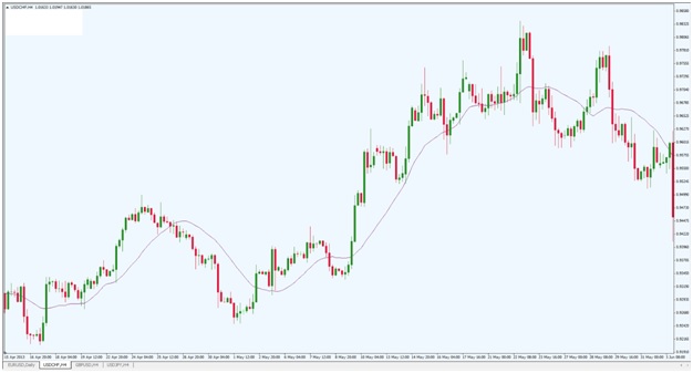
Chart Source: Metatrader
In looking at the USD/CHF chart above, we can see a 20-day SMA plotted against price activity. Note that the SMA is plotted on the chart itself, whereas many other technical indicators are recorded below the price activity in isolation. The SMA is shown in purple, and rises and falls roughly in-line with the price activity itself. It is also important to note that an SMA is a dynamic indicator (rather than a static indicator). This means that the SMA will continue to change in value as long as the underlying prices continue to change in value. Positive momentum is seen when prices rise above the SMA. Negative momentum is seen when prices fall below the SMA.
Short-term SMAs move quickly in response to changes in price. Longer-term SMA will show more lag. Let’s plot another SMA on the same USD/CHF chart:
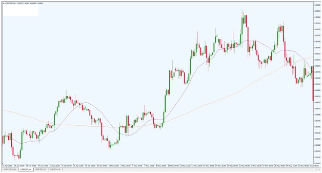
Chart Source: MetaTrader
In this next example, we can see a 100-day SMA added to the chart (shown in orange). This SMA follows all of the same rules, but it is plotted using a different time frame. Since this SMA accounts for trading periods that stretch back 100 days, the plotted result is much smoother and responds less quickly to changes in price. Neither SMA is “better” than the other, they simply give forex traders different pieces of information. When using two or more moving averages, bullish buy signals are sent when the shorter-term SMA crosses above the longer-term SMA. Bearish sell signals are sent when the shorter-term SMA crosses below the longer-term SMA.
Exponential Moving Averages
Next, we look at exponential moving averages, or EMAs. The simple moving average gives equal weight to each of the trading period that are used in its calculation. This is not true for EMAs. Instead, EMAs give greater weight to trading periods that are more recent.
Let’s take a look at the same chart in USD/CHF and use EMAs to plot the historical averages:
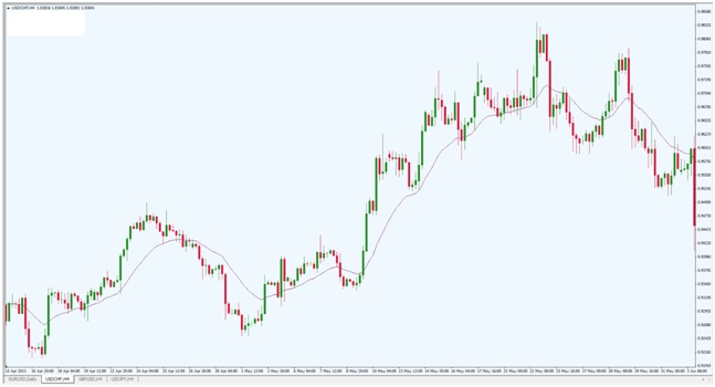
Chart Source: MetaTrader
In this USD/CHF chart, the purple line represents the 20-day EMA. When we look at this price chart, you will probably notice many similarities to the initial chart showing the plotted 20-day SMA. But if we look closely at the exact price levels that mark the moving averages, there are differences that can be noted. Specifically, the EMA will react more quickly to price changes, as the recent changes are more heavily weighted in the calculation of the averages. This becomes more apparent when we use longer-term EMAs like the 100-day EMA.
Note the following chart example:
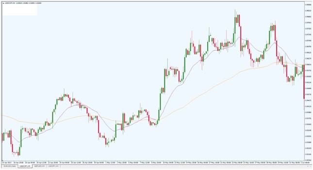
Chart Source: MetaTrader
Here, the 100-day EMA is added to the chart and shown in orange. Differences between the 100-day SMA and the 100-day EMA are more pronounced, as there is a much wider time frame that is taken into consideration. These differences are important because buy and sell signals will be sent at different times. All of the same trading rules apply to both SMAs and EMAs. Price activity above the EMA suggests bullish momentum is in place, while price activity below the EMA suggests bearish momentum is in place. If the shorter-term EMA crosses above the longer-term EMA, a bullish buy signal is triggered. If the shorter-term EMA crosses below the longer-term EMA, a bearish sell signal is triggered. The only differences here will be seen in the specific price levels themselves.
Line Charts Vs Candlestick Charts
Anyone that is serious about forex trading will inevitably be spending a great deal of time looking at currency charts. This holds true even for traders that are employing strategies in fundamental analysis. The fact of the matter is that even fundamental traders will need to settle on specific entry levels for their trades, and the only way to actively monitor the position once executed is to use price charts.
But not all price charts look the same, or transmit the same information. Two of the most common chart types can be found in line charts and candlestick charts. Here, we will look at the visual differences between the two chart types and then explain why most active traders tend to choose one of these types over the other.
Line Charts
In forex markets, the most basic chart type is the line chart. This chart type will plot time values along the X-axis and price values along the Y-axis. Let’s take an example of the AUD/USD plotted visually using a line chart:
Chart Source: Metatrader
In this example, we can see a very basic representation of the daily price history in the AUD/USD. Since the AUD is the base currency, rising values suggest that the AUD is making gains on the USD. Conversely, declining price values would suggest that the USD is making gains on the AUD. If we are simply trying to understand where the exchange rate is heading, a line chart gives forex traders a quick, no-frills method making these determinations. Unfortunately, the line on this chart plots the closing values for each daily period — and nothing else. If we want to know more about what exactly happened to prices during each daily interval, we will need to find another chart type that represents price history in a more detailed way.
Candlestick Charts
The most popular choice for forex traders looking for a detailed representation of all the price activity that has taken place during a given time interval is the candlestick chart. Where line charts plot only the closing price for each time interval, candlestick charts take things a step further, outlining the opening price, closing price, the interval price high, and the interval price low for each period.
Let’s break down each candlestick into its component parts:
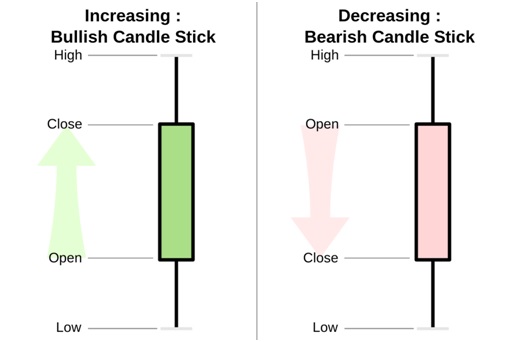
Chart Source: Wikipedia
In the graphic above, we can see how each candlestick on your chart will represent price activity. There are two different candlestick types: bullish candles, and bearish candles. The color of each candle type is generally different (this helps to distinguish directional momentum at a quick glance). But other than this, both candle types follow the same structural rules.
Each time interval is made up of a candle body, an upper wick, and a lower wick. The upper wick always represents the highest price point for that time interval. The lower wick always represents the lowest price point for that time interval. The candle bodies change depending on whether or not the time interval was bullish or bearish. A bullish interval will have a closing price that is higher than its opening price. A bearish interval will have a closing price that is lower than its opening price. So, if we have a bullish candle the top of the candle body will represent the closing price for the time interval. If we have a bearish candle the top of the candle body will represent the opening price for the time interval.
Let’s now take a look at the original AUD/USD price activity, plotted using candlestick charts:
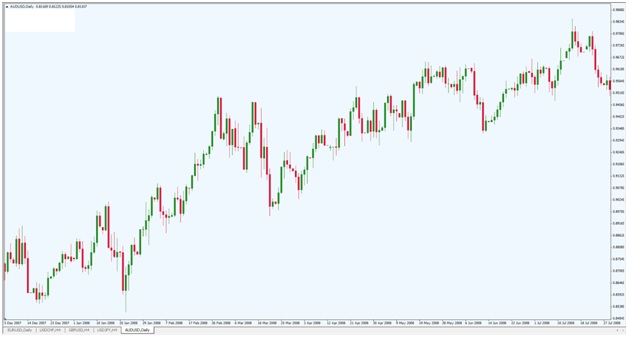
Chart Source: Metatrader
It should be noted here that the differences are relatively stark, even though the exact same price data is being used. Specifically, forex traders are able to use the candlestick chart to see how market momentum unfolded during each time interval. In this example, green candlesticks are used to represent bullish time intervals. Red candlesticks are used to represent bearish time intervals. We can also see how far prices actually travelled during each time interval. Was the period in question volatile? Or did prices finish the interval at nearly the same price shown at the open?
These are factors that could not even be considered when using a simple line chart. For these reasons, active forex traders tend to rely on candlestick charts, rather than the simple line charts. Line charts can be great if you are trying to get an idea of where current prices are — and nothing more. But if you are looking to analyze the specific activity that was seen during each time interval, it is very hard to argue against the use of candlestick charts in your trading.
Interest Rates and Rollover
One factor that is unique in forex markets is the fact that positions in any currency are going to be associated with an underlying interest rate. This is not true for assets like stocks and commodities. But it should be remember that forex traders are literally buying and selling money. If you are buying (long) a currency, it is similar to depositing that currency into your bank account. If you are selling (short) a currency, it is similar to taking out a loan in that currency. As you know, depositing your money into a bank will earn interest. Taking out a loan of any kind will cost you interest. For these reasons, you will always need to be aware of the interest rate levels that are associated with the currencies you are trading.
Interest Rate Differentials
In most cases, the currencies you trade will not be associated with the same interest rate. The difference between the two interest rates is also referred to as the interest rate differential. When you are long the currency with a higher yielding interest rate, your position will automatically gain the difference. When you are short the currency with a higher yielding interest rate, your position will automatically lose the difference. These gains and losses act independently of the underlying exchange rate value. So, for example, the underlying exchange rate could work in an unanticipated direction and the position would lose money. But if you are long the currency with the higher interest rate yield, some of those losses would be offset by the interest rate gains that your position generates.
Rollover In Forex Markets
In order for interest rate differentials to be a material factor in your positioning, you will need to hold the position through the rollover period. Here, rollover refers to something very different when compared to what is seen in futures markets. In forex, the rollover period occurs when a position is held from one value date to the next value date. In simpler terms, you can usually think of this as holding a position from one business day to the next — with the business day ending at 5pm.
This means that you can avoid rollover if you close your position before the end of the business day. This might be advantageous if you are long the currency with the lower yielding interest rates. This is a common practice for day traders and those with a very short term trading outlook. But sometimes it is better to just pay the extra interest costs when you position is trading negative and you feel as though the market needs more time to start working in your favor. From a relatively perspective, interest rate costs (and gains) are much smaller than the gains and losses that are incurred by fluctuations in the underlying exchange rate.
Long Term Positions Vs. Short Term Positions
For traders that are looking to capitalize on the interest rate differential in a forex pair, time frames are critically important. These types of strategies will generally work only for those traders that are willing to hold positions for an extended period of time. Remember, these strategies are similar to putting your money into a bank account — and these strategies need time in order to accumulate interest gains of any real value. If you were to put your money into a savings account, you would not see any significant benefit if you withdrew your money the following day.
Forex markets work the same way, and traders looking to benefit from interest rate differentials will need to give the position enough time to accumulate gains that are worth the effort. Interest rates are a critical component of the forex market, and this is not something that should be overlooked — especially by long term traders. For day traders, these factors could be considered as negligible. But when positions are held for extended periods, interest rate rollover can really add up and even eat into your profits for positions that are trading in positive territory.
Defining Support and Resistance Levels
One of the central tasks for any forex trader is to identify areas where a currency should be bought or sold. This is much easier said than done but it can be argued that the best approach for accomplishing this is to spot historical support and resistance levels that are likely to be visible on the charts watched by most traders. Here we will discuss the market elements that create support and resistance levels, and then look at a few visual examples on real-time forex charts.
What is Support and Resistance?
First, it is important to understand what is needed in order to create a support or resistance level. Specifically, resistance levels are created when prices are rising, reach a higher point of exhaustion, and then the majority of the forex market steps in to start selling that currency. Conversely, support levels are created when prices are falling, reach a lower point of exhaustion, and then the majority of the forex market steps in to start buying that currency. It is really a question of supply and demand: Prices hit lows and start to rise when demand increases (support). Prices hit highs and start to fall when demand increases (resistance).
Visual Examples
Having an understanding of the underlying logic is helpful. But once this is done, most forex traders focus on the visuals that are generated on the currency charts themselves.
Consider the following chart in the GBP/USD:
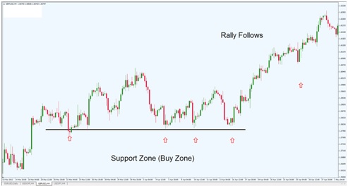 Chart Source: Metatrader
What information can be gleaned from this chart graphic? Specifically, we can see that forex traders are constantly buying the GBP/USD when prices fall to the black line. This occurs on four different occasions. So, in the future, forex traders would probably be looking to establish long positions if prices were to fall to that level again in the future. In forex, one of the central tenets of technical analysis is the argument that prices are like to repeat the activity that was seen in the past, so it would not be surprising to see increased buying activity if prices were to drop to the black support line again in the future.
This is why the lower area with the upward arrows is labeled as the Buy Zone, as this price region would be a likely candidate for establishing new long positions. In this example, prices in the GBP/USD rally substantially after the support zone if tested four times. So we can see that the support level is used as something of a platform to propel prices higher going forward.
Next, consider this chart in the USD/CHF:
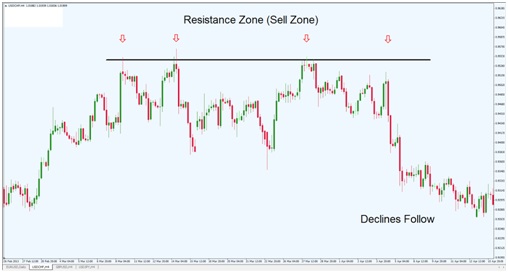 Chart Source: Metatrader
What information can be identified using this next chart graphic? Specifically, we can see that forex traders are constantly selling the USD/CHF when prices rise to hit to the black resistance line. This also occurs on four different occasions. In the future, forex traders would probably be looking to establish short positions if prices were to rise to hit that level again in the future. Prices would be expected to repeat the historical activity that was seen in the past, so it would not be surprising to see increased selling activity if prices were to drop to the black support line again in the future.
This is why the upper area with the red arrows is labeled as the Sell Zone, as this price region would be a likely candidate for establishing new short positions. In this example, prices in the USD/CHF decline substantially after the resistance zone is tested four times. The resistance level is used as something of a barrier preventing prices from going any higher, and this eventually leads to bearish declines going forward.
Setting Stop Losses
Support and resistance levels can also be very useful when setting stop losses. All forex trades should have a protective stop losses, so these price structures can be useful in a number of different ways. Specifically, resistance levels can be used for short positions when setting a stop loss — the stop order itself should be placed at least five pips above the price level associated with the resistance line. Conversely, support levels can be used for long positions when setting a stop loss — the stop order itself should be placed at least five pips below the price level associated with the support line.
Stop Losses and Money Management
When we get started in trading the forex markets, it can be very easy to focus solely on the positives. Of course, there are many positives to be had. Trading the largest and most liquid market in the world can be a very lucrative business that has the potential to generate substantial profits over time. But in order to reach this level of success, you will need to focus a good deal of attention on the less glamorous side of forex trading. This means having a solid understanding of stop loss placement and risk management. Without this, the potential positives will be very difficult (or even impossible) to capture.
Protecting Your Trades with Stop Losses
Most forex trading platforms will allow you to place a stop loss on your position. This is a feature that is there for a reason, and it is never a good idea to have an open forex position that does not include a protective stop loss. The unfortunate reality is that no trade is ever assured a 100% certainty for success. And the only way to protect yourself (and your account balance) from surprise market volatility is to have a hard stop order in place for situations where the market might start to move in the wrong direction.
There are many different strategies that forex traders can use in determining where stop losses should be placed. Some traders use a simple pip count. For example, a trader might choose to risk no more than 40 or 50 pips in a single trade. Other strategies place stops to limit losses relative to your account balance. These traders might choose to risk no more than 2-3% of their account in any single position. Whatever your strategy, it is important to keep in mind that no forex position is risk-proof and that the only way to avoid excessive and unnecessary losses is to have a hard stop order in place at all times.
Risk/Reward and Money Management
The next factor to consider is money management, which inevitably involves an analysis of risk and potential reward for each of your positions. In all cases, you will need to have a risk-to-reward ratio that is favorable. A risk-to-reward ratio is simply a comparison of a trade’s potential for profits relatively to its potential for losses. If your trades do not have a suitable risk-to-reward ratio, your losses will quickly erase all of your gains and prevent you from achieving long-term profitability.
Ideally, forex traders tend to look for positions that have a risk-to-reward ratio of at least 2:1. This means that your trade carries with it the potential to gain $2 for every $1 that is put at risk. There is some degree of flexibility here, however. In some cases, a ratio of 1.5:1 might be acceptable ($1.50 in potential profits for every $1 that is being put at risk). In other cases, a trader might want to wait only for opportunities that come with a ratio of 3:1. Anything higher than this tends to be unrealistic, and be associated with trades that are unlikely to actually move in your chosen direction. With this in mind, it is generally best to keep a conservative approach and to be realistic. This will generally mean that a risk-to-reward ratio of 2:1 should be considered sufficient.
Forex Trading is Long-Term, Not Get Rich Quick
Overall, forex trading should be viewed as a long-term enterprise — and not a scheme to get rich quick. Traders that fail to avoid risk (and use hard stop losses) are setting themselves up for failure with unrealistic expectations that can never be achieved on a consistent basis. Proper trade planning must always include conservative money management, where risk-to-reward ratios are favorable and achievable over the long-term. There are different strategies for how these practices can be executed but these are some of the general rules that must be honored if you want to keep your account balance healthy and growing over time.